Friday 31 October 2008

HEDKANDI - Experiments


Once I had found a lens obscurer thingy (this lovely little bug courtesy of the lovely Gina), I put in front of the camera lens and took these photos.
Some experiments with my video camera, beautifully accompanied by the sound of Johnny Depp slaughtering his customers in Sweeney Todd.


HEDKANDI - Obscured Lens

Progressing on from the kaleidoscope idea, I’m now looking at obscuring the lens of the camera to create distorted images. As always, Queen have illustrated the point I am trying to make:Just thinking about the shapes seen in kaleidoscopes and these lens obscurer thingys, I’ve thought different ways I could use these in the packaging. But lets not dwell on the packaging aspect, lets dwell on the identity aspect. dwellThis is just me playing around in photoshop because I couldn’t find a lens thingy in time for the presentation. I’ve used a figure because that was the image in my head but I may move away from using this as it may be too similar to the current illustrations. I want to make it more abstract as well – there might not necessarily be anything recognizable, just snippets. As you can see I’ve applied the logo I was messing around with. The fading out goes well with the image. I’ve added some extra sparkles just to make even more exciting than it already is.
Feedback from the crit: people said the lens effect implied movement. I was surprised to see that nobody else had done the same thing with the logo. I was quite pleased with how my approach to it compared to other peoples. I was quite surprised by people’s reactions on the whole really. I wasn’t confident about this response at all and was amazed I wasn’t laughed out the room! I’m going to carry on along these lines as I’m inspired by the images and shapes and colours and also because I’m excited about creating my own images with a lens!

MOLOKO VIDEO
I was told to look at this video by few people after they had seen my ideas. Its really made me want to experiment with moving image – I realize this isn’t a moving image brief but it could produce results that I wouldn’t get from simply taking still images or playing on the computer.

HEDKANDI - Kalidoscope

I’ve gone back to thinking about how to incorporate the colours again. Going down a more abstract route, I’ve been looking at the patterns kaleidoscopes make.
These are just some rough examples I tried, including the HedKandi logo and clubbing colours.
Yes, they are quite pretty but I don’t know what to do with them yet.

HEDKANDI - Calm before the storm

This is just a random idea thrown in there – thought of when panicking about what to do! It doesn’t follow in the same thought processes as the previous posts; I just thought I’d show it anyway. I wanted to move away from the clutter and busyness that I’d been working with – as had everyone else. I started to think of how and when the new products would be used and I imagined a scene of girls getting ready to go out clubbing. This got me thinking about the clubbing situation becoming a huge event, a natural phenomenon like a volcano that’s about to erupt! This led me on to the phrase “calm before the storm”. The imagery I’ve chosen is designed to contrast with the bright colours and abstract images of other beauty products on offer. Also, it is completely different to the previous HedKandi persona.

HEDKANDI - Logo


Thinking about how the brand should change and what it should change into, I thought about adapting the logo (we discussed in class other companies that have had to change their identity to keep up with changing trends i.e. French Connection – FCUK and Calvin Klein – CK)…….

I really quite like the shapes of the letters of the current logo. The arm things of the ‘K’ remind me of the controls on CD players.

Monday 20 October 2008

MOMIJI - First Proposed Treatment

I have come up with two alternatives in response to the brief - the reason for which is that I still need to experiment with each of them in order to establish which treatment works most effectively. Both solutions consist of the same narrative; they are just dealt with using different treatments. The principal concept is that the Momiji dolls have built their world - and they are still building it. The viewer is able to witness the construction of this world as the camera pans along.

Treatment One; Looking at the title 'spread the love' I began to think of how this concept could manifest itself visually. I instantly imagined colours as being the 'love' that is being spread. I then went on to experiment with different ways of making paint spread across the page - as it does when the paper is already wet. Through doing several of these experiments, I discovered that it was possible to create the impression of the paint spreading without my hands appearing in the frame.

When applied to the narrative, the buildings, plants etc. in their world will form out of the spreading colour as the camera moves along. The result will be very different from the current graphic illustrations currently on the website. The effect will appeal to the more 'artsy' fans because it will be alternative and appear more creative than ordinary ways of representing products. The imagery produced is also reminiscent of traditional Japanese painting, which will reinforce the dolls oriental impression.

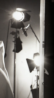
Treatment Two; This idea uses imagery that is produced solely on the computer. Because its overall appearance will be cleaner and more ordered, there will be more room to play with each dolls individual character. The screen will be busy with objects and dolls moving everywhere as they build their world and partake in their favorite activities.

Thinking about the style of the music I will use, after listening to the small animations on the Momiji website, I was reminded of the work of Aphex Twin. Some of the songs I have chosen to look at possess the cute, child-like impression, however, they also have a metallic, clanking, techno-e sound operating in the back ground which gives it the twist Momiji are looking for. I've also been pointed in the direction of a band called 'mum'; these too, have the two very different elements conjoined. As I wont be able to use these pieces directly in my piece because of copy write issues, I will endeavor to find somebody to compose a piece which possess the components I felt to be appropriate in my examples. In both cases, the noises created are evocative of industrial building work - representing the building work of the Momiji dolls world.
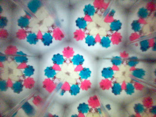
MOMIJI - video experiments cont.

Moving on from simply putting the ink randomly onto the page, I’m looking at how the ink can be sort of moulded into the shapes I want. I thought I could do this by laying down water in the shapes of where I wanted the ink to go. When the ink is added to the water, it will spread out creating the shape. It’s proving quite hard at the moment to not make it look crappy.


Kate showed me this video that proves that it can be done and actually look good so that’s encouraging.

MOMIJI - film experiments (more to come)

These are some experiments I did with how ink spreads onto wet paper. I need to see how I’m going to film the ink spreading without my hands getting in the shot to create the illusion of the paint spreading by itself. I also played about with splatting ink into water. Not sure how useful this was but it was fun!


MOMIJI - initial research

I was instantly reminded of this video by one dot zero. I like the blending and contrasting of sharp lines and shapes with the fading colours.
Some stills from videos currently on the Momiji website. Despite what people say I don’t think they’re all that bad although the music is AWFUL and makes me want to shoot all the little Momiji dolls.
Just looking at traditional Japanese painting for the fun of it. Because it is fun.


HEDKANDI - Initail treatment ideas

My idea fosters its roots in the clubbing environment. The package will be predominantly black, the main box being made out of a durable material such as card, and then covered in black cloth (as used in book binding). These materials will give an authoritative impression as well as feeling expensive in your hands. They will also make the product feel heavy which will add to the luxurious quality. On two sides of the box, there will be imagery based on the LED screens that are often positioned behind the DJ; comprising of the typical bright, almost fluorescent colours you find in nightclubs. There are two possible ways this could be done
The first is by de-bossing into the black cloth, the small rectangular shapes which constitute the LED screen. In these shapes, the colour will be printed on using gloss paint, contrasting with the texture of the cloth.

The second choice is having a sleeve design, in which the black clothed section is separate from the inside and can slide off. The LED holes are punched through to reveal the coloured imagery underneath.

In both instances, the logo will appear as a solid object - not punched through with the rest of the holes.

Thursday 16 October 2008

HEDKANDI - Clubbing Colours

I decided to return to the roots of the brand - the clubbing environment. I looked at photos of events hosted by HedKandi – as do most photos taken in clubs, they all possess the same range of colours - very bright, almost fluorescent.
I then started to look at the LED screens that are normally behind the DJ.

HEDKANDI - Experiments

The room was completely dark; all there was to be seen was the occasional flash of coloured light from the corner. Shopping bags, olive oil and ink were being used to obscure the flares.

Olive oil
Green
No flash
Blue
Orange
Orange from further away

HEDKANDI - Night Vision

I was first interested in looking at night-vision filming because I really like the way peoples eyes look - they remind me of wildlife programs that use infra-red cameras! These are some examples I found in a music video to illustrate my idea:


I finally found the button on my video camera to enable me to video in ‘night mode’. These are just some experiments:
Although I really like the look of these images, I feel I have moved away from the clubbing theme - people don’t have night-vision video cameras in nightclubs - they have either normal eyes, or normal digital cameras with flashes. I shall continue by looking at photos experimenting with colour and flash.

Wednesday 15 October 2008

HEDKANDI - First thoughts

I began by thinking of the reasons why a fan of HedKandi (as a music and entertainment brand) would then choose to purchase other unrelated products sold by them. It might reflect another side to that persons life - if a girl is seen using a HedKandi product, it could be assumed that she enjoys clubbing, is a fan of dance music and she enjoys a good night out - all connotations are induced by the sight of the HedKandi logo.

Look¬ing through videos and photos on the HedKandi website, I was reminded of this photo by Michael Thompson; probably because of the content, but I liked the grainy quality and the lighting.

I’ve been searching for photos that possess the qualities I want in my work. I like black and white photography. When I think of the kind of style HedKandi want, I imagine lights, glamour, jewellery, taking their own phrase “deliciously stylish”.

I thought about coming back to the music aspect as this is the area HedKandi began – maybe even including elements of the live music HedKandi sometimes promote.